Dataset health checks
Dataset health runs at refresh, before training, so you find out what you are working with while changing it is still cheap.
What it represents
One question, asked before you spend a run: is this configuration worth training on?
The panel appears in two places. On the wizard’s Review and Train step it is the wall you work through before the Train button will let you go. On a model’s page it is a Dataset health card holding the recommendations from the last refresh.
Four things sit behind it. How many records your configuration produced after filters. How many of those count as conversions, and at what rate. How much signal each selected field carries. And a list of specific recommendations.
The counts are the headline. A model is a summary of your conversions, so the number of conversions is the real constraint, not the number of records.
How it’s calculated
Refresh assembles the dataset exactly as training would, applies your success criteria, and counts. Conversion rate is conversions divided by total records.
The recommendations fire on fixed thresholds, and they are worth knowing:
- Under 500 records is critical · under 1,000 is a warning
- Fewer than 50 conversions is a warning, with 50 as the recommended floor
- A conversion rate under 1% is critical · under 5% is a warning · above 90% is a warning that the criteria are too broad
- More than five fields populated under 10% of the time gets one warning between them · a field with more than 500 distinct values gets an informational note of its own
- Records created in the last 90 days converting far below the older ones is a warning, because those records have not had time to convert yet
Read it block by block
Every block below is a readout with an action behind it. This is the order they render in, top to bottom.
-
Press Run diagnostics
The button sits in the Dataset health header and again at the bottom of the step. Before you press it the panel is honest that it has nothing: "Run diagnostics to check your dataset before training." While it works it reads Running, and afterwards it reads either Up to date or Re-run Diagnostics.
Re-run it after every configuration change. The Train button stays disabled until the diagnostics match the configuration in front of you, so this is not optional discipline, it is the gate.
-
Read the two counts before anything else
merged records is what your configuration assembled. Beside it, success is how many of those met your criteria, with the rate in brackets.
Hold the success count against 50. Under it, everything further down the panel is being measured on very few examples, and the honest move is to widen the date range or loosen the success criteria before you read another block.
-
Take the Field signal bar as a whole
One bar under Field signal, split into Strong, Medium, Weak, and None, counting your selected fields. It is a shape, not a score.
A bar that is mostly None says the problem is the field selection rather than the model. Go back to the Data step and add fields your team actually maintains. A bar with a healthy Strong band is your signal to carry on reading.
-
Scan Per-Field Signal for two things
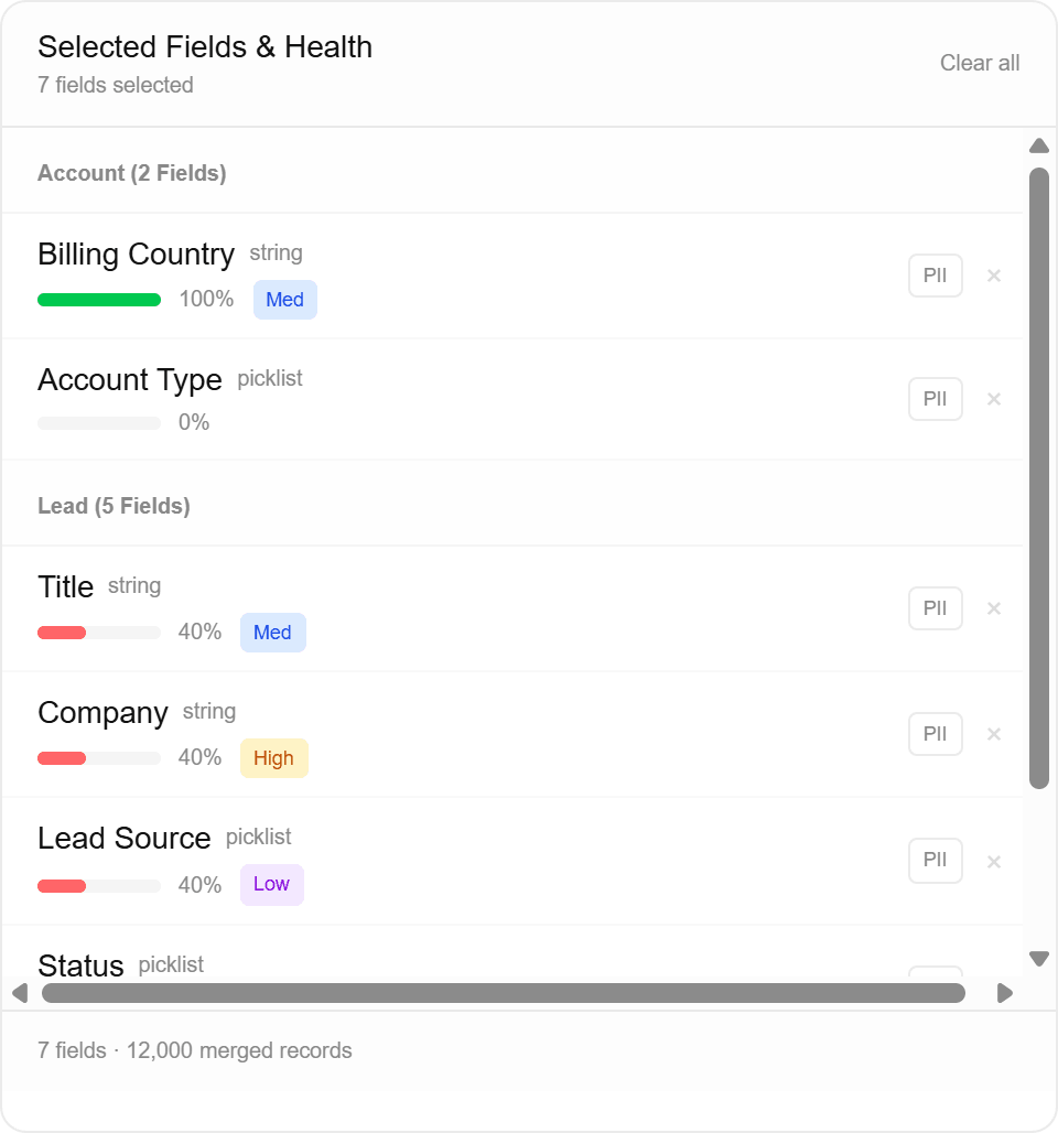
A row per field: Field, Type, Pop (how often it is filled in), and Signal. Fields with a handful of distinct values get a signal badge reading Suspicious, Strong, Medium, Weak, or None. Numeric fields get a bar instead, running left and right from centre, with an arrow saying which direction goes with conversion. The table sorts strongest first and shows the top 20 until you ask for the rest.
Two things are worth stopping on. A row at 0% or close to it is a column that exists and holds nothing, so drop it. A row badged Suspicious, with a red triangle beside the field name, separates conversions from non-conversions more sharply than a real predictor should · read it as a leakage candidate rather than as your best field.
-
Work the Redundant fields cards
Each card names two of your fields and how closely they track each other, and suggests removing one. Nothing is removed for you.
Keep the better populated of the pair and drop the other, then re-run. An empty section is the common case and means nothing is wrong.
-
Read Recommendations, and check what each one is scoped to
Critical, warning, and informational cards, coloured accordingly. This is the block that tells you what to change.
The scoping rule matters and is not obvious. A recommendation that names a specific field is only shown when that field is in your selection. The dataset-wide ones · record counts, conversion rate, sparse-field counts, leakage · are always shown, because they are read off the whole assembled dataset rather than off the fields you picked. So a leakage warning can name fields you never selected. Check the names against Selected Fields & Health on the Data step before you act on one.
When there is nothing to say, the panel says so: "No issues found. Ready to train." That state is the whole readout, not an empty one.
-
Decide whether to train or to go back
A critical card puts a line under the Train button saying results may be affected. It does not block you. Training on a critical dataset is allowed on purpose, because sometimes you want to see the number anyway.
Go back for the two fixes that pay: trim a date filter that is dragging your conversion rate down, and cut the fields sitting at 0%. Both are cheaper now than after a run.
What it means for you
The 50-conversion floor is a guideline, not a switch. Below it the model still trains and still produces numbers, but those numbers rest on so few examples that a handful of records can swing them. Treat results from a thin dataset as directional and retrain when more history lands.
Recent records are the quiet one. A cohort created in the last 90 days that converts far below the older ones usually has not had time to convert yet, which drags your conversion rate down and teaches the model that new records do not convert. It arrives as a recommendation naming the date field rather than as a chart, and trimming the date filter back is often the single highest-value fix on this panel.
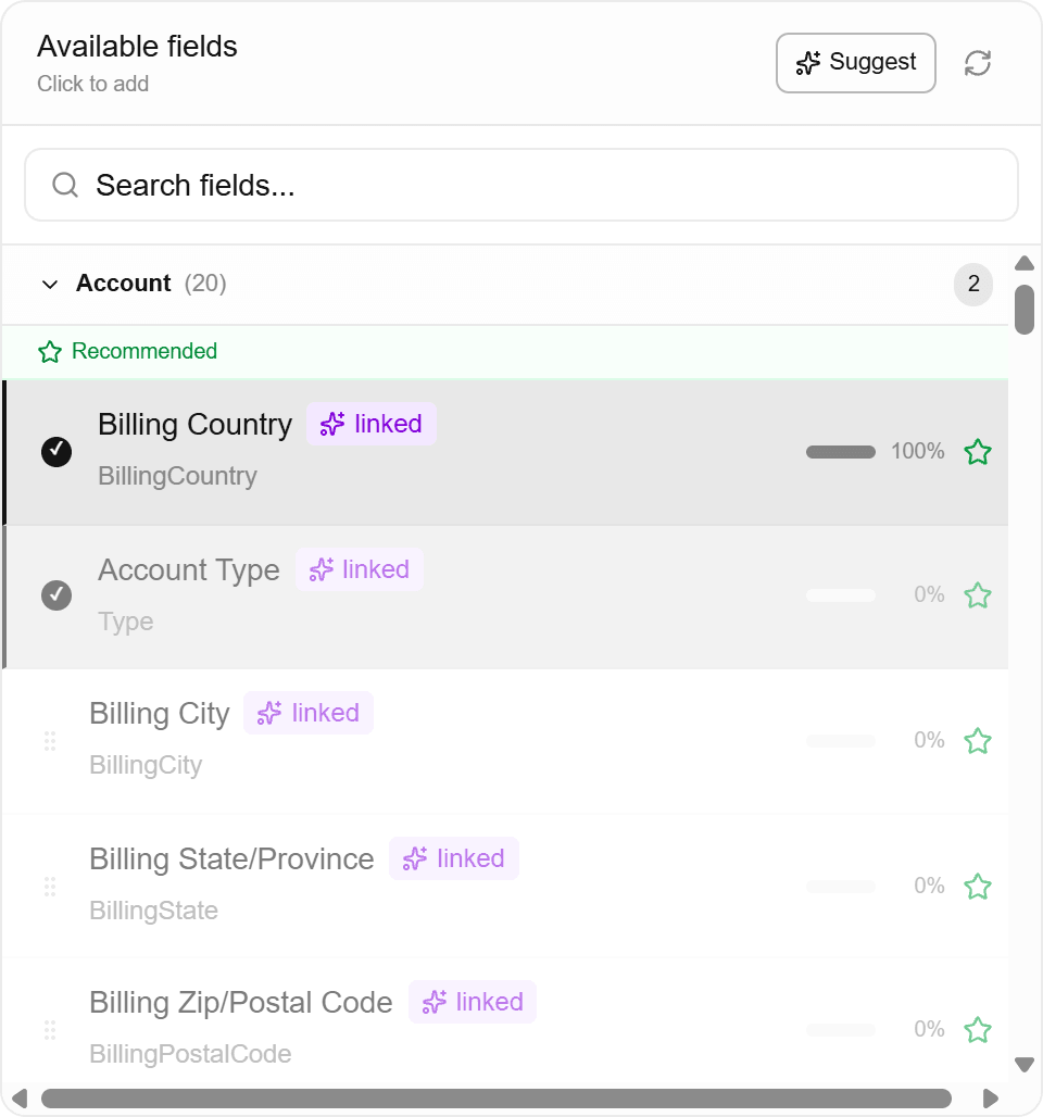
The other fix is the field list itself, and it happens one step earlier. The available-fields panel shows the same fill percentage before a field is ever selected, so a column that is going to trip the under-10% recommendation is visible at the moment you would have added it.
Check your understanding
Refresh reports 8,400 merged records with 210 success, a 2.5% rate. You clear the 50-conversion floor comfortably and pick up a low-rate warning. That is a workable dataset. Expect a moderate AUC and read lift as the number that matters, because with conversions this rare the ranking is doing the useful work.
Read that back against the panel. The two counts are what cleared the floor. The rate is what raised the warning, and the warning is dataset-wide, so it is about your criteria rather than about any one field. Nothing in that readout says stop · it says train, then read lift first.