The lift curve
AUC tells you the ranking is sound. The lift curve tells you what the ranking is worth.
What it represents
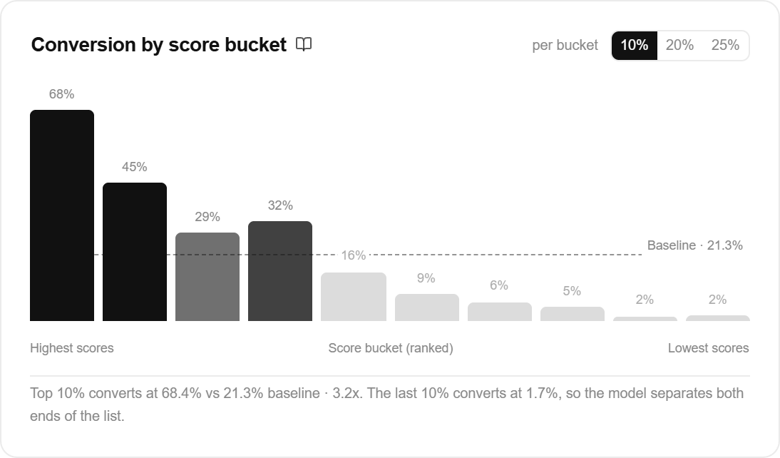
Each bar answers one question: if I work this slice of the ranked list, what share of it converts?
The dashed line across the chart is the baseline, the rate you get working the list in no particular order. A bar above the line is a slice worth more than an average slice. A bar below it is worth less.
The bars are one slice each, not a running total. The first bar is the top 10% of records by score, the second is the next 10%, and the last is the lowest-scored tenth. Reading left to right you are walking down the ranking, and the height of each bar is that band’s own conversion rate.
That is why the shape carries two findings, not one. The bars above the line tell you where the good records are. The bars below it tell you which records will not convert, which is the half most teams forget they bought. A model that lifts the top tenth to 68% and drops the lowest tenth to 3% is doing real work at both ends, and the muted bars are drawn that way on purpose.
The toggle in the card header cuts the same list into wider slices, 10%, 20% or 25%. Wider slices are steadier, since each one holds more records; narrower slices show the drop-off in more detail. Training stores cut points every 10%, so the 25% view marks its boundaries with a tilde to say they were interpolated between two stored points.
How it’s calculated
ax1om sorts the held-out evaluation records by score, walks down the list in ten steps, and records the conversion rate down to each step. The chart turns those running totals back into each band’s own rate by taking the difference between two neighbouring steps, so what you see is the slice, not the running total.
The baseline is the conversion rate of the whole held-out set, which is the same number the last running total lands on.
Reading the cumulative view. One number on the page is deliberately still a running total: lift at the top 20%, which has its own card. It answers a different question, not “what does this band convert at” but “if I work the top fifth of the list, how much richer is everything I touch than an unsorted fifth would be”. That is the number to take into a capacity conversation, and it is why the card says top 20% rather than naming a band. The same running-total reading is used in the draft model comparison, where it sits beside that card.
One structural limit worth knowing about that cumulative number: lift at the top 20% can never exceed 5x, and at the top 10% never exceeds 10x. If every single conversion landed in the top 20%, that slice would hold five times its share, and no model can beat that. So a 4x lift at 20% is not 4 out of a possible 100. It is 4 out of a possible 5.
What it means for you
Worked example. Baseline conversion is 4%. The top 10% converts at 12%, three times the baseline. The next 10% converts at 6%. The bottom 30% converts at under 1%. Two decisions fall out of that: work the top band first, and stop somewhere before the bars cross the line, because past that point you are doing worse than working the list unsorted.
Read the shape, not just the peak. A steep fall from left to right is a model separating well. Bars that all sit near the baseline line mean the model is not distinguishing high scorers from low ones, and the app flags that as low differentiation. A flat chart and an AUC near 0.5 travel together, since both are reading the same lack of signal. The usual fix is more predictive fields, engagement history first.
One caution on the low bars. They are a statement about a band of scores, not a verdict on any one record in it. A bar at 3% still means three records in a hundred convert, so treat the bottom bands as a place to spend less effort, not a list to delete.