Feature analysis, decoded
The feature table is where a score stops being a number and starts being a reason. Five columns, each answering a different question.
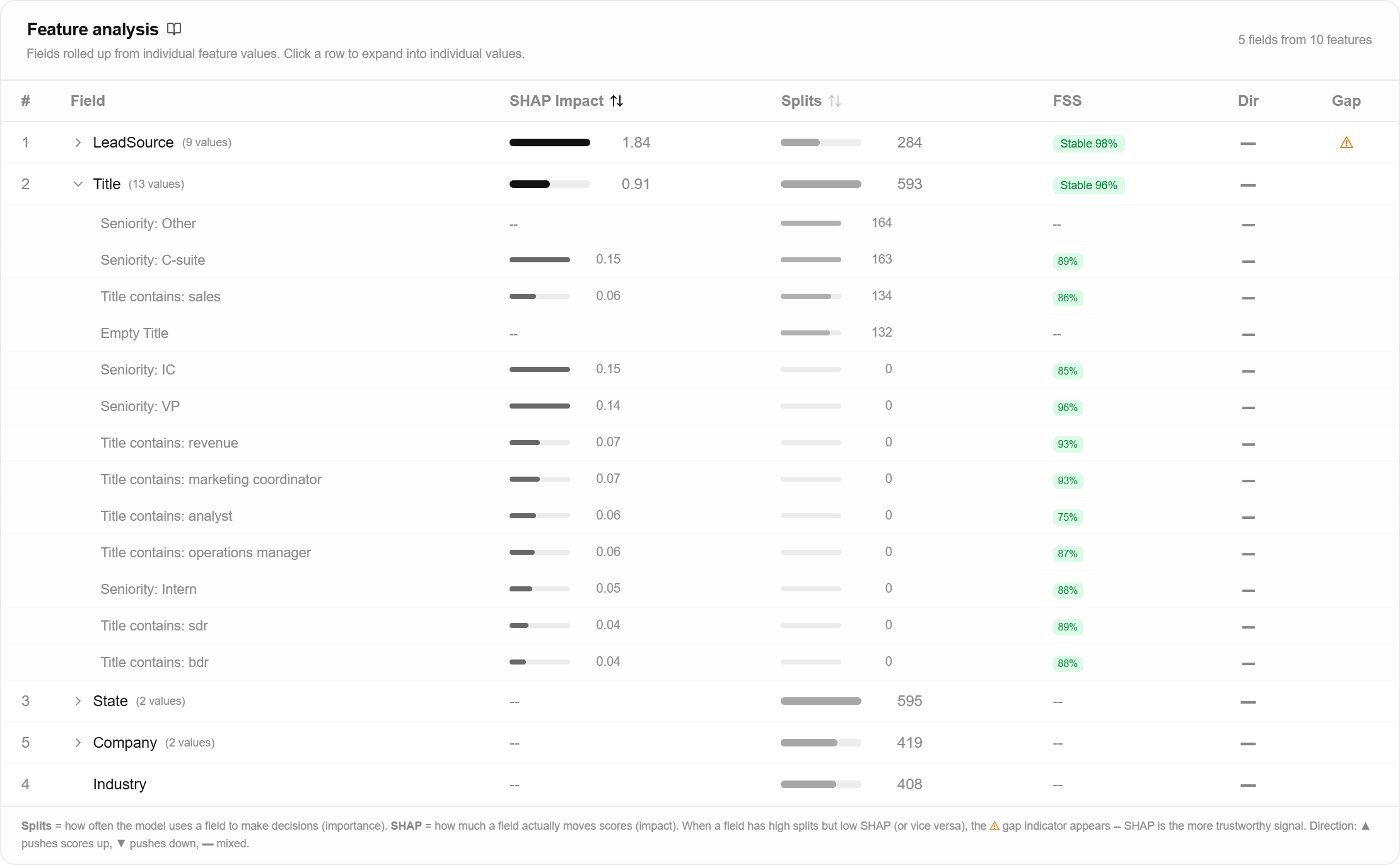
What it represents
SHAP impact is how much a field moves scores. A high value means changing that field materially changes where a record lands.
Splits is how often the model uses the field to make a decision. High splits with low impact means the model consults the field constantly and the effect mostly cancels out.
FSS is feature stability: how consistently a field’s importance survives retraining. Above 0.7 reads stable · 0.4 to 0.7 moderate · below 0.4 unstable.
Dir shows which way the field pushes scores overall. Up, down, or mixed when the net direction is too close to zero to call.
Gap is a flag, not a measure. It appears when a field’s rank by splits and its rank by impact differ by three or more places.
How it’s calculated
Impact is the average size of the field’s SHAP effect across the records the model was explained on, ignoring whether each effect was up or down. Splits come straight from the trained model’s split counts. Rows are rolled up from individual feature values to the parent field, so a categorical with 40 values reads as one row you can expand.
Stability is computed separately, with five-fold cross validation: a fresh model per fold, importances recomputed each time, and the score reflects how little that importance wobbled across the five. On datasets above 50,000 records both the impact figures and the stability run use a stratified sample, and the app says so above the table when it does.
What it means for you
When splits and impact disagree, trust impact. That is what the gap flag is telling you.
Worked example. industry ranks 2nd by splits and 9th by impact, so the gap flag appears. The model splits on industry often, but those splits push scores up as often as down, so industry is not really driving outcomes. Reporting it as your second-biggest driver would be wrong.
Read stability alongside impact, never alone. A field with almost no impact that is consistently almost no impact scores as perfectly stable, which is true and useless. What you want in your top rows is high impact and stability above 0.7, because those are the drivers that will still be there after the next retrain.
Stability is not a leakage check. A field that encodes the outcome leaks the same way in every fold, so it looks beautifully stable. The leakage banner is the surface for that.