Reading the score distribution
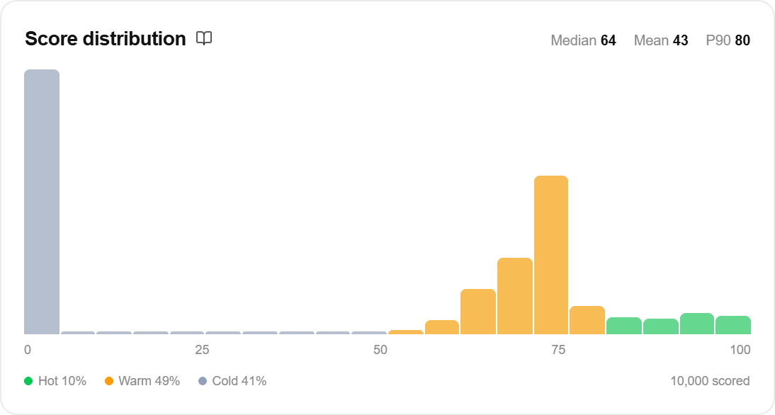
The score distribution shows every scored record laid out from 0 to 100, so you can see the shape of what the model produced rather than a single summary number.
What it represents
A score is the model’s conversion likelihood for that record, expressed on a 0 to 100 scale. A record at 72 ranks above a record at 41.
Three bands sit under the histogram, at fixed cut points: hot is 80 and above · warm is 50 to 79 · cold is below 50. The percentages next to them are the share of the scored population in each band.
On a risk score the same three bands sit at the same cut points and carry different names, because the top band is now the records you should worry about: at risk · watch · stable. Which set you see follows the score’s own answer to “What does a high score mean here?”, and it is set on the score rather than inferred from the starting point it came from.
Two things the score is not. It is not a percentage of anything your team can bank, and the per-record factors do not add up to it. Factors show which fields pushed a record up or down relative to a typical record. They explain the movement, not the total.
How it’s calculated
Every record in the scoring run gets scored by the fitted model, and the histogram bins those scores into 20 buckets. The card reads out the median, the mean, and the 90th percentile.
The scored count in the corner is usually larger than the records the model trained on, because scoring applies the model to the full population, not just labeled history.
What it means for you
Worked example. Baseline conversion is 4%. The distribution is heavily right-skewed: median 18, mean 24, P90 at 61, with 3% hot and 62% cold. That is a healthy shape. Conversions are rare in this dataset, so most records should score low, and the thin hot tail is the model doing its job.
The bands are fixed cut points, not quantiles. On a low-baseline dataset a good model can legitimately show almost no hot records, and that is not a fault to fix. Prioritize by rank, take the top N% you have capacity for, and treat the bands as labels rather than targets.
Shapes worth a second look. A single narrow spike with everything between 45 and 55 means the model is not separating, and the lift curve will be flat to match. A large hot pile on a low-baseline dataset points the other way, usually at a field that encodes the outcome, so check the leakage banner before celebrating.